
But anyways about mine and Brittany's project--
I feel like our plan was good. The execution? Not so much. To start, we should've measured how much space we had in the window and made things fit more appropriately. I can't believe I didn't even think of that. What we did looked okay but personally I was bothered by it because it wasn't exactly how it was supposed to be.
No knock on Brittany at all, she was an awesome partner and very kind...I know I can be frustrating so I applaud her. BUT I don't think we connected exactly. That's not her fault. I pull inspiration from weird places. I enjoy different things and where I'm coming from can be really abstract. That's why I think I tend to stutter a bit or not be able to explain things well... because I know not everyone likes what I like.
For example...visually I pulled from cover art for the singer The Weeknd and his project "House Of Balloons" (could also look at Echoes of Silence or Thrusday, same concept).
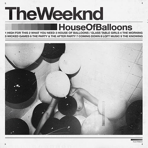
The cover art has a very Crate & Barrel catalog cover feel. I love how all information is presented to you at once. It's straight forward and the basics of what you need to know. Title, Tracks, Artist.
So what I took from this was the way everything is organized. You don't need excessive detail to make something effective.
Another visual I pulled inspiration from is the way clothing brands set up sell sheets. Honestly I did one for my own brand that I'm working on and I was inspired by myself...but for the sake of this blog and the class I'll show a random one from Google..

More and more I look at architecture as a plan for art work. When I do a project I have everything I do measured out exactly how it needs to be so it's PERFECT. I didn't even realize I did this until this semester.
You can see the inspiration turned to reality via my plan for the project..

Conceptually, Brittany and I both liked the idea behind "Coexist" and the way everyone knows what it is and yet it's only a sticker that you see on cars. I tired telling her that we needed to create something that people could look at and identify without having to read a paragraph or use their brain at all to figure out. Seeing the "WE" logo...people may not know exactly what it stands for but assumption will likely be made.
In conclusion..
I'm glad I worked with Brittany. She's an awesome person and I REALLY REALLY appreciate her being so kind to me...it meant alot. As you know I've been struggling lately and trying hard to just bottle things up and deal with it...so I appreciate having a partner who tried to understand and work with me.
I'll never forget that she said she was intimidated to work with me. I think WAY too much but maybe I'm kind of an intimidating person. See this is where I run into problems...I don't want to change but I feel like I need to in order to draw people in. All I wanna do is be a nice person who helps others and succeeds and what I wanna do. I don't wanna intimidate people and one of the things that bothers me more than ANYTHING is when I think people have the wrong idea about me....so I hope she at least knows now that I'm not stuck up or intimidating....I hope I was a good partner.
Specifically about our project....yeah it should've been better. It was hard working with someone on something with a touchy subject and not have enough time to REALLY plan our thoughts out.
I feel bad that our presentation went poorly but I guess it's in the past now.
No comments:
Post a Comment